add*() functions.roads data set.To install ‘cholera’ from CRAN:
install.packages("cholera")To install the current development version from GitHub:
# You may need to first install the 'remotes' via install.packages("remotes").
remotes::install_github("lindbrook/cholera", build_vignettes = TRUE)John Snow’s map, published in his On The Mode Of Communication Of Cholera, of the 1854 cholera outbreak in London is one of the best known examples of data visualization and information design:

By plotting the number and location of fatalities using stacks of bars on a map, Snow was able to perform a task that is now easily taken for granted: he visualized a spatial distribution. Looking at the results, the pattern on the map seems unmistakable. The map appears to support Snow’s claims that cholera is a waterborne disease and that the pump on Broad Street is the source of the outbreak.
And yet, despite its virtues, the map failed to convince either the authorities or Snow’s colleagues in the medical and scientific communities. Even today, many are skeptical of the map’s ability to support such claims. Beyond considerations of time and place, what critics past and present are picking up on is that a concentration of cases around the Broad Street pump alone should not be enough to convince us. The problem is the map does not refute the primary rival explanation to waterborne transmission: the pattern we see is not unlike what airborne transmission (miasma theory) might look like. In other words, while the presence of a pump at or near the epicenter of the distribution of fatalities is strong circumstantial evidence, it is nonetheless circumstantial.
This may be the reason why Snow added a graphical annotation to a second lesser-known version of the map, published in the Report On The Cholera Outbreak In The Parish Of St. James, Westminster, During The Autumn Of 1854.

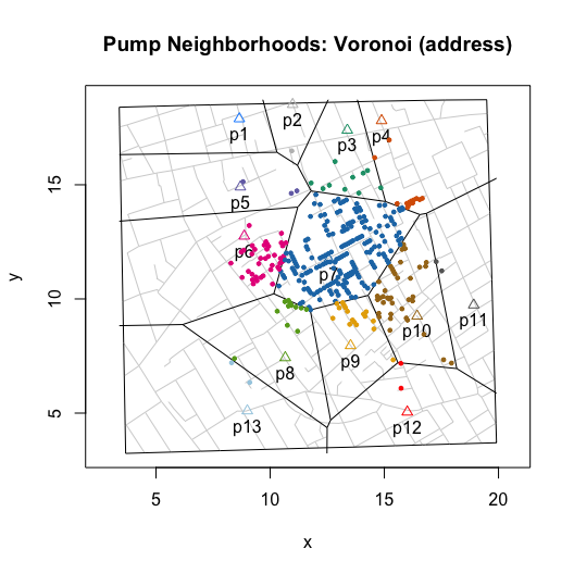
Despite its hand-drawn, back-of-the-envelope appearance, Snow writes: “The inner dotted line on the map shews [sic] the various points which have been found by careful measurement to be at an equal distance by the nearest road from the pump in Broad Street and the surrounding pumps …” (Ibid., p. 109). My interpretation of this statement is that, guided by the principle that all else being equal people tend to choose the closest pump, Snow is computing a pump neighborhood: the set of addresses or locations defined by their relative proximity to a specific water pump. By doing so, Snow’s annotation sets limits on where we should and should not find fatalities. In short, Snow’s annotation is a hypothesis or prediction.
While his actual data and the specifics method of computation appear to be lost to history, I reverse engineer what I infer to be his approach by doing the following. First, from the quotation above I assume that his measure of proximity is the walking distance along the streets of Soho. Second, putting aside aside questions about the map’s accuracy (it’s actually a commercial map that Snow annotated), I consider the map to be the definitive “text” and make it the de facto source of data.
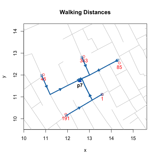
I then wrote functions that compute and visualize walking distances on the map. The value of these functions go beyond the ability to replicate and validate Snow’s efforts. By allowing you to compute hypothetical neighborhoods via selective inclusion or exclusion of pumps or to allow for different measures of proximity (e.g., Euclidean), they also allow you to explore counterfactual scenarios. Ultimately, this can help us to better assess whether we really can use the map to “prove” Snow’s claims.
While walking distanced based neighborhoods are based on paths that follow streets, Euclidean distance based neighborhoods are based on straight line paths between a location and the nearest (or selected) pump:
streetNameLocator(zoom = 1, cases = NULL, highlight = FALSE, add.subtitle = FALSE, add.title = FALSE)
title(main = "Walking Distances")
invisible(lapply(c(1, 191, 46, 363, 85), addWalkingPath))

streetNameLocator(zoom = 1, cases = NULL, highlight = FALSE, add.subtitle = FALSE, add.title = FALSE)
title(main = "Euclidean Distances")
invisible(lapply(c(1, 191, 46, 363, 85), addEuclideanPath))

To build a neighborhood, we apply this algorithm to each location or “address” with at least one observed fatality. This builds the “observed” neighborhood:
plot(neighborhoodWalking())
plot(neighborhoodEuclidean())

Ultimately, for testing purposes we want the “expected”
neighborhoods. For walking neighborhoods, I use the same approach but
use simulated data. Using sp::spsample() and
sp::Polygon(), I place 20,000 regularly spaced points,
which lie approximately 6 meters apart,
cholera:::unitMeter(dist(regular.cases[1:2, ])), across the
face of the map and then compute the shortest path to the nearest
pump.
plot(neighborhoodWalking(case.set = "expected"), type = "area.polygons")
For Euclidean distance based neighborhoods, we can use the same simulated data and compute the as-the-crow-flies distance to the nearest pump. Or, we can leverage a more computationally efficient approach, Voronoi tessellation, which will produce the same neighborhoods.
plot(neighborhoodEuclidean(case.set = "expected"))
plot(neighborhoodVoronoi())

To explore “observed” walking neighborhoods, use
neighborhoodWalking() with the pump.select
argument:
plot(neighborhoodWalking(pump.select = 6:7))
plot(neighborhoodWalking(pump.select = -7))

To explore “expected” walking neighborhoods, add the case.set = “expected” argument:
plot(neighborhoodWalking(pump.select = 6:7, case.set = "expected"), type = "area.polygons")
plot(neighborhoodWalking(pump.select = -7, case.set = "expected"), type = "area.polygons")

To explore “observed” Euclidean neighborhoods, use
neighborhoodEuclidean() with the pump.select
argument:
plot(neighborhoodEuclidean(pump.select = 6:7))
plot(neighborhoodEuclidean(pump.select = -7))

To explore “expected” Euclidean neighborhoods, use
neighborhoodVoronoi() with the pump.select
argument:
plot(neighborhoodVoronoi(pump.select = 6:7))
plot(neighborhoodVoronoi(pump.select = -7))

Parallelization is implemented using the ‘parallel’ package, which is
part of the base R distribution. Where applicable, parallelization is
enabled by default via multi.core = TRUE (you can also set
or limit the number of cores by passing an integer or by setting
multi.core = FALSE. Note that although some precautions are
taken in the R application, the developers of the ‘parallel’ package
strongly discourage against using parallelization within a GUI or
embedded environment. See vignette("parallelization") for
details. That said, I’ve had few, if any, problems with using the
package in parallel on macOS with either the R application or the RStudio
IDE.
‘cholera’
now has georeferenced (longitude and latitude) versions of
nearly all data and functions. For functions, this works by
setting latlong = TRUE where available.
Georeferencing was done using QGIS; specifically the Georeferencer tool and its interface to OpenStreetMap. The target coordinate reference system (CRS) of these data is EPSG:4326. Note that the georeferenced results are still provisional: the choice of ground control points, transformation type (e.g., thin plate spine), and resampling method (e.g., nearest neighbor) may change in the future.
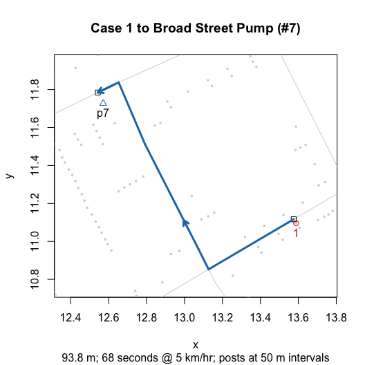
Here’s one example:
plot(walkingPath(latlong = TRUE))
plot(walkingPath())  # Dodson and Tobler native scale for comparison

The vignettes are available online at the links below.
Duplicate and Missing Cases describes the two coding errors and the three misplaced cases that I argue are present in Dodson and Tobler’s (1992) digitization of Snow’s map.
“Unstacking” Bars discusses the inferential and visual reasons to “unstack” bars. Then, it describes the two “unstacked” data sets: one using “fatalities” and one using “addresses” as the unit of observation.
Roads
covers issues related to roads. This includes discussion of how and why
I move pump #5 from Queen Street (I) to Marlborough Mews, the overall
structure of the roads data set, “valid” road names, and my
back-of-the-envelope translation from the map’s nominal scale to meters
(and yards).
voronoiPolygons():
Tiles, Triangles and Polygons focuses on the
voronoiPolygons() function, which extracts the vertices of
triangles (Delaunay triangulation) and tiles (Dirichelet or Voronoi
tessellation) from deldir::deldir() for use with polygon()
and other functions.
Kernel
Density Plot discusses the the syntax of
addKernelDensity(), which allows you to define
“populations” and subsets of pumps. This syntax is used in many of the
functions in ‘cholera’.
Time Series discusses functions and data related to the aggregate time series fatalities data and the questions surrounding the effect of the removal of the handle from the Broad Street pump.
Parallelization discusses the parallelization of selected functions and provides benchmark timings.
The lab notes, which are available online, go into detail about certain issues and topics discussed in the vignettes:
note on duplicate and missing cases documents the specifics of how I fixed the two apparent coding errors and three apparently misplaced cases in Dodson and Tobler’s data.
Clifford Street missing segment discusses the missing segment at the far Eastern end of Clifford Street in Dodson and Tobler’s (1992) digitization of Snow’s map.
computing street addresses discusses how I use orthogonal projection and hierarchical cluster analysis to “unstack” bars and compute a stack’s “address”.
Euclidean
v. Voronoi neighborhoods discusses why there are separate functions,
neighborhoodEuclidean() and
neighborhoodVoronoi(), for Euclidean distance based
neighborhoods.
points v. polygons discusses the tradeoff between using points() and polygon() to plot “expected” neighborhood using area plots and the computation of polygon vertices.
computing Voronoi diagrams with geographic data describes the problems and a working solution for computing Voronoi diagrams with data that use latitude and longitude.
references is an informal list of articles and books about cholera, John Snow and the 1854 outbreak.