
![]()


MexBrewer is a package with color palettes inspired by the works of Mexican painters and muralists. This package was motivated and draws heavily from the code of Blake R. Mills’s {MetBrewer}, the package with color palettes form the Metropolitan Museum of Art of New York. The structure of the package and coding, like {MetBrewer}, are based on {PNWColors} and {wesanderson}.
Currently, there is only a development version of {MexBrewer}, which can be installed like so:
if (!require("remotes")) install.packages("remotes")
remotes::install_github("paezha/MexBrewer") This palette is called Revolucion.
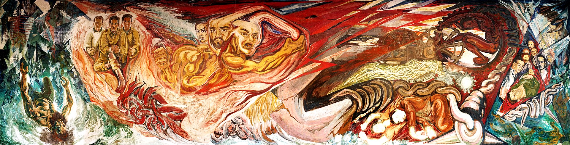
Revolucion
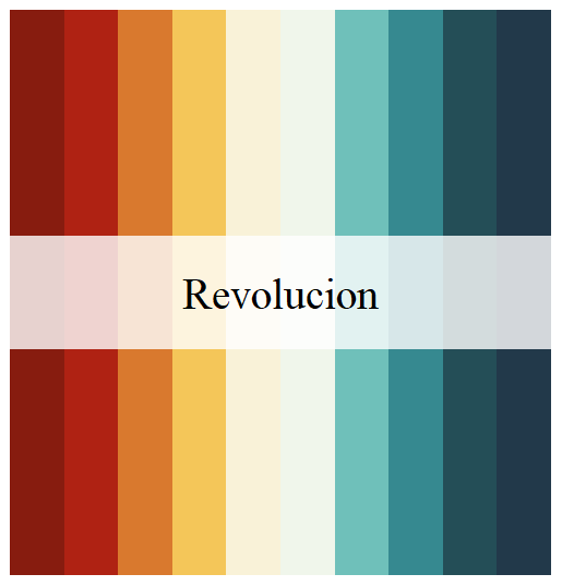
Revolucion
This palette is called Naturaleza.
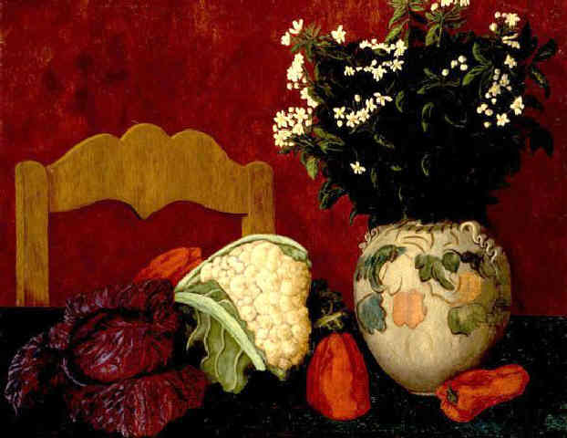
Naturaleza
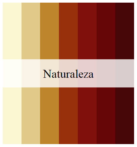
Naturaleza
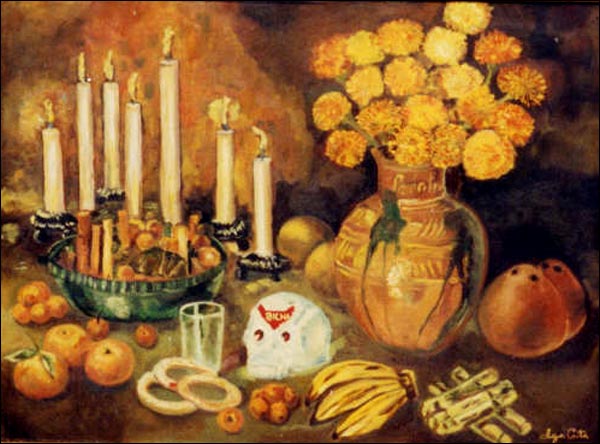
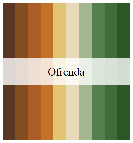
This palette is called Ofrenda.
Ofrenda
Ofrenda
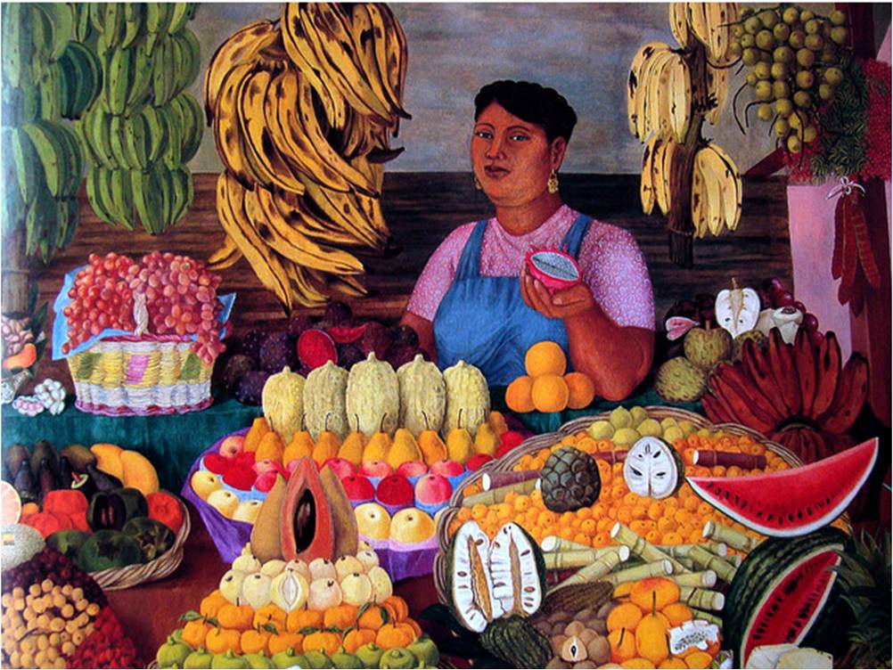
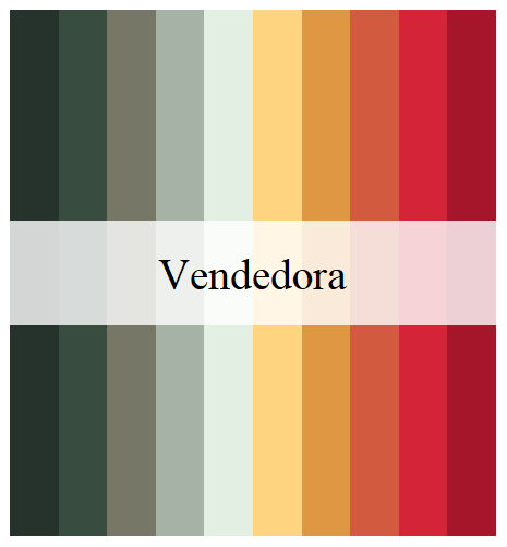
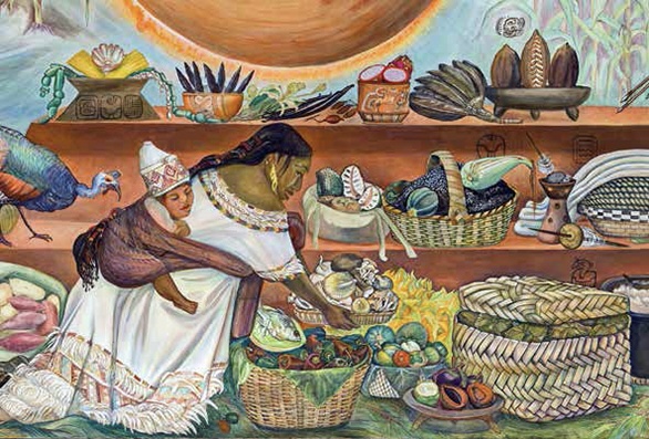
This palette is called Vendedora.
Vendedora
Vendedora
This palette is called Alacena.
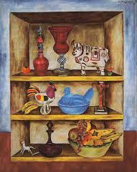
Alacena
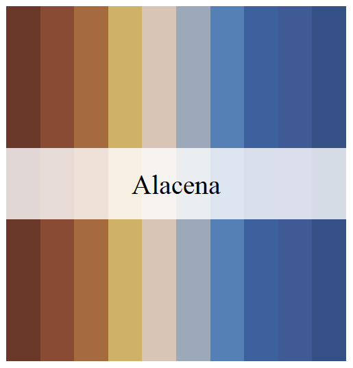
Alacena
This palette is called Tierra.
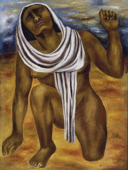
Tierra
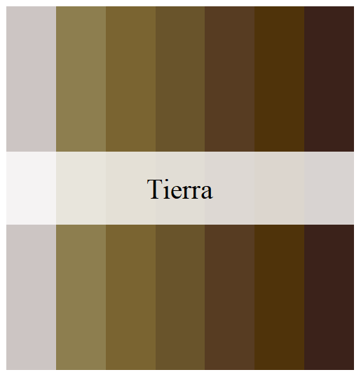
Tierra
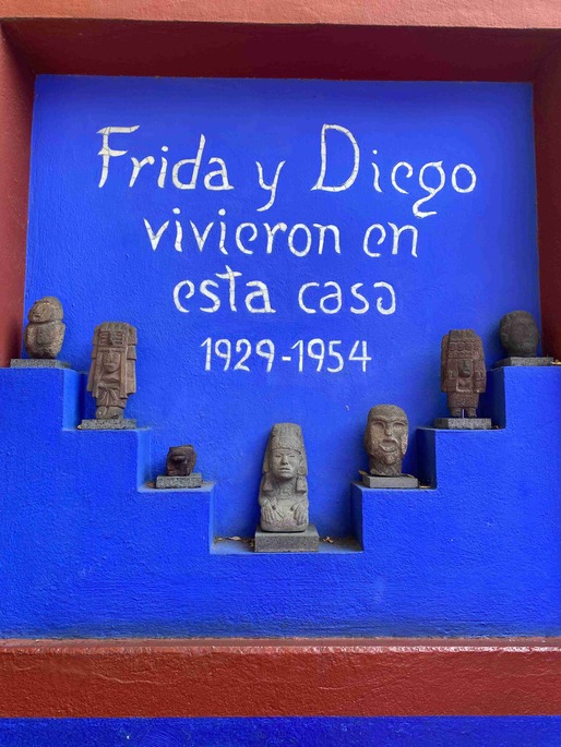
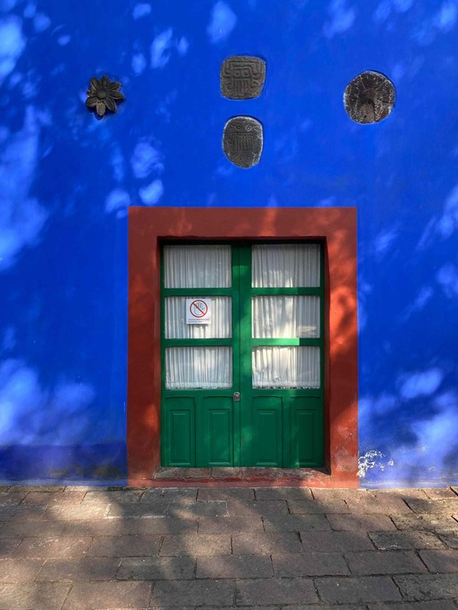
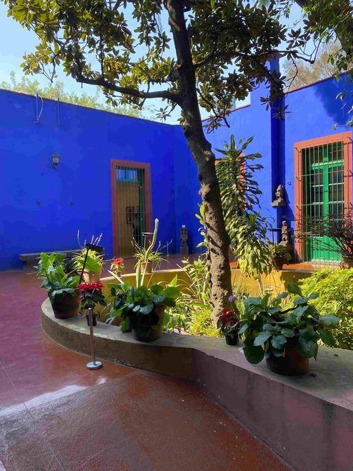
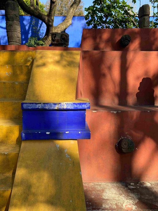
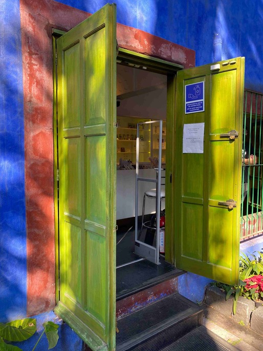
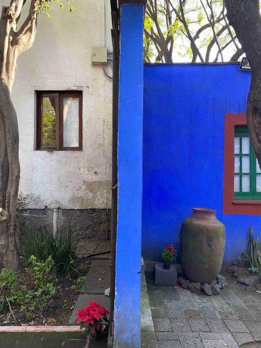
These palettes are called Casita1, Casita2,
and Casita3. They are inspired by the colors of Frida’s home in
Coyoacán, Mexico City.
Casa Azul
Casa Azul
Casa Azul
Casa Azul
Casa Azul
Casa Azul
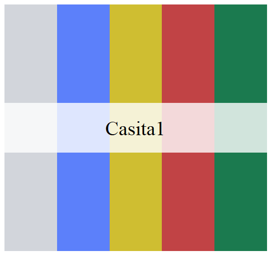
Casita1
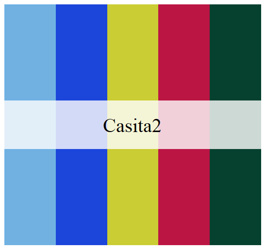
Casita2
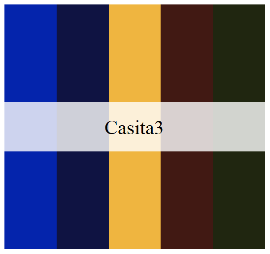
Casita3
This palette is called Maiz.
Maiz
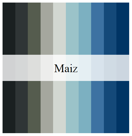
Maiz
This palette is called Ronda.
Ronda
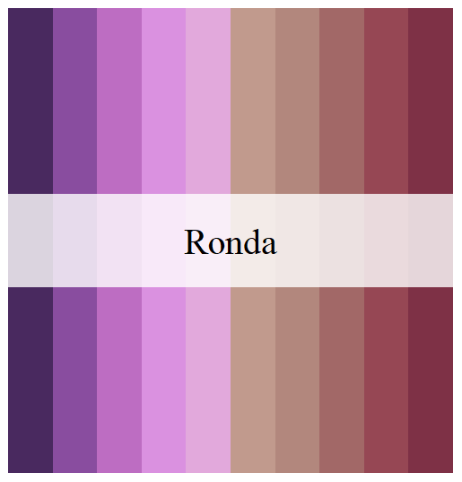
Ronda
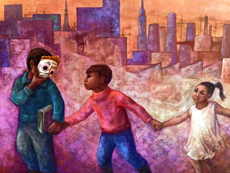
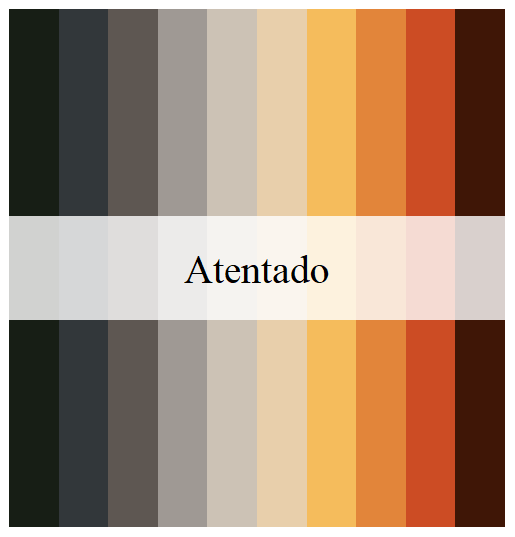
This palette is called Atentado.
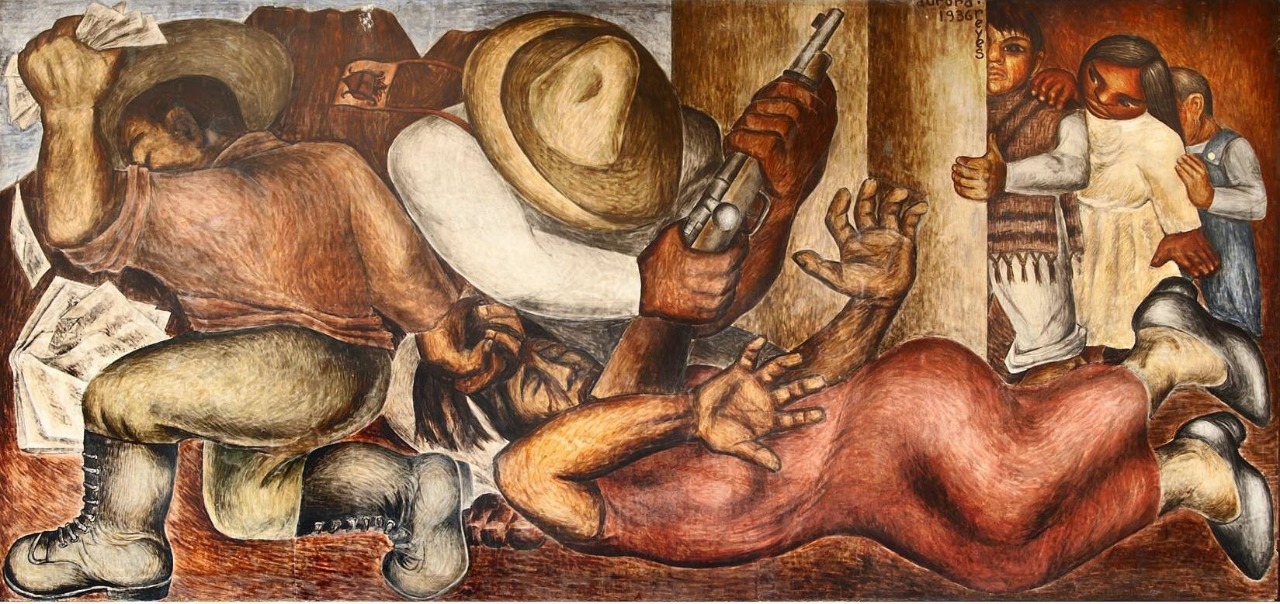
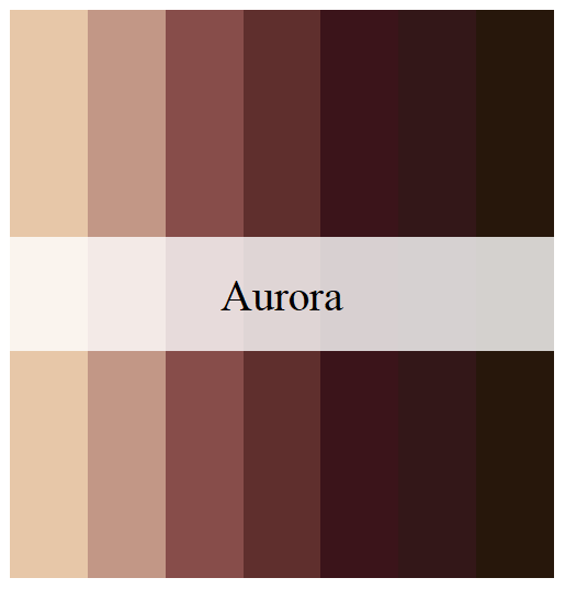
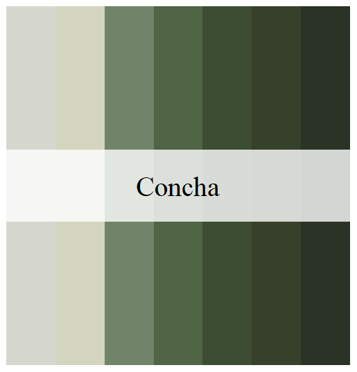
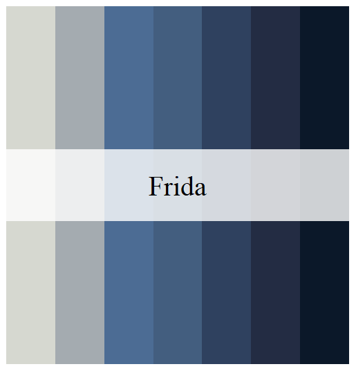
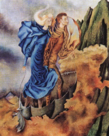
Aurora, Concha, y Frida
Aurora
This work of Aurora Rivera inspired three palettes, called
Aurora, Concha, and Frida.
Aurora, Concha, y Frida
Aurora
Concha
Frida
This palette is called Huida.
La Huida
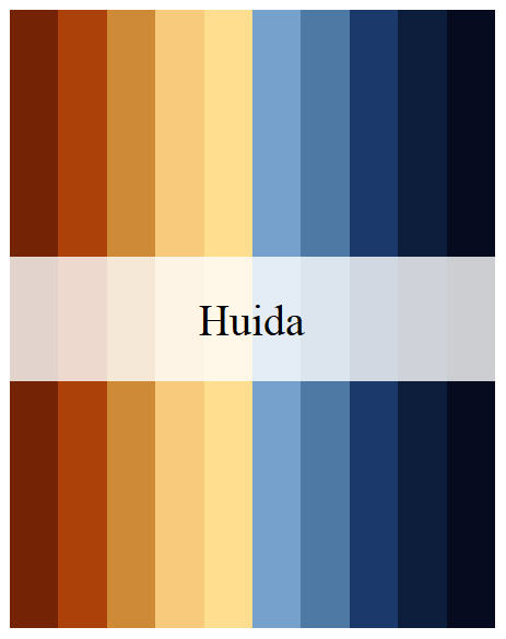
Huida
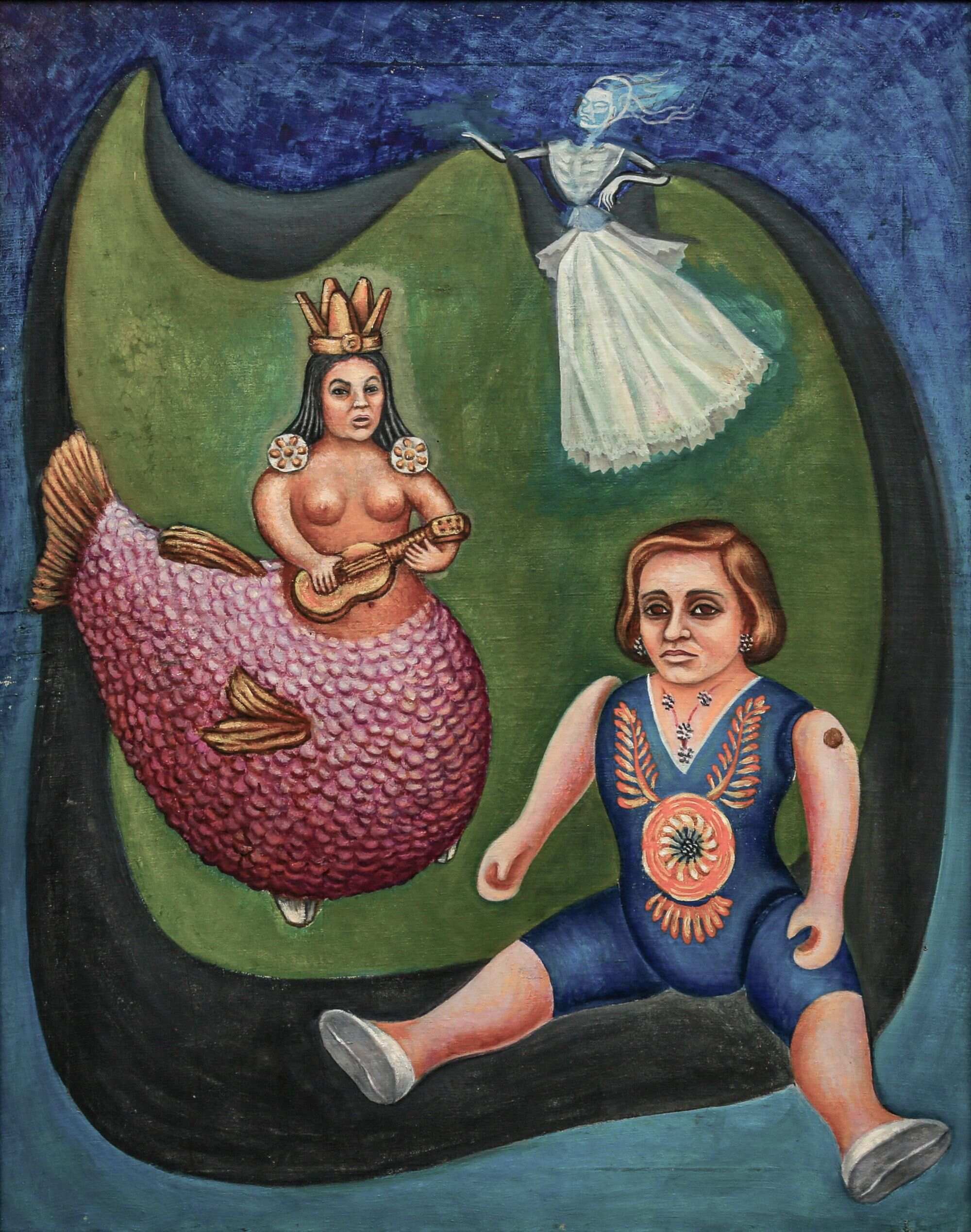
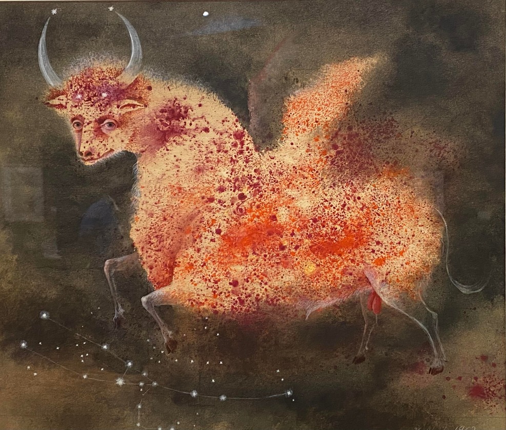
This work of Remedios Varo inspired two palettes, called
Taurus1 and Taurus2.
Taurus
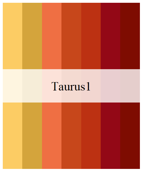
Taurus1
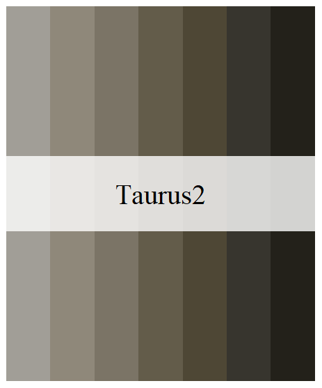
Taurus2
library(aRtsy) # Koen Derks' package for generative art
library(flametree) # Danielle Navarro's package for generative art
library(MexBrewer)
library(sf)
library(tidyverse)
Invoke data sets used in the examples:
data("mx_estados") # Simple features object with the boundaries of states in Mexico
data("df_mxstate_2020") # Data from {mxmaps }with population statistics at the state level
Join population statistics to state boundaries:
mx_estados <- mx_estados |>
  left_join(df_mxstate_2020 |>
              #Percentage of population that speak an indigenous language
              mutate(pct_ind_lang = indigenous_language/pop * 100) |>
              dplyr::transmute(pop2020 = pop,
                               am2020 = afromexican,
                               state_name,
                               pct_ind_lang),
            by = c("nombre" = "state_name"))
Distribution of population by geographic region in Mexico:
ggplot(data = mx_estados,
       aes(x = region, y = pop2020, fill = region)) +
  geom_boxplot() +
  scale_fill_manual(values = mex.brewer("Concha", n = 5)) +
  theme_minimal()
Percentage of population who speak an indigenous language in 2020 by state:
ggplot() +
  geom_sf(data = mx_estados,
          aes(fill = pct_ind_lang),
          color = "white",
          size = 0.08) +
  scale_fill_gradientn(colors = mex.brewer("Tierra")) +
  theme_minimal()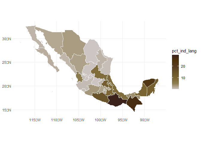
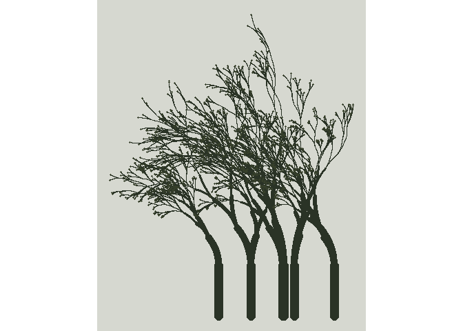
The following three images were created using the {flametree} package.
# pick some colours
shades <- MexBrewer::mex.brewer("Vendedora") |>
  as.vector()

# data structure defining the trees
dat <- flametree_grow(seed = 3563,
                      time = 11,
                      trees = 10)

# draw the plot
dat |>
  flametree_plot(
    background = shades[1],
    palette = shades[2:length(shades)],
    style = "nativeflora"
  )
# pick some colours
shades <- MexBrewer::mex.brewer("Concha") |>
  as.vector()

# data structure defining the trees
dat <- flametree_grow(seed = 3536,
                      time = 8,
                      trees = 6)

# draw the plot
dat |>
  flametree_plot(
    background = shades[1],
    palette = rev(shades[2:length(shades)]),
    style = "wisp"
  )
# pick some colours
shades <- MexBrewer::mex.brewer("Maiz") |>
  as.vector()

# data structure defining the trees
dat <- flametree_grow(seed = 3653,
                      time = 8,
                      trees = 6)

# draw the plot
dat |>
  flametree_plot(
    background = shades[1],
    palette = shades[2:length(shades)],
    style = "minimal"
  )
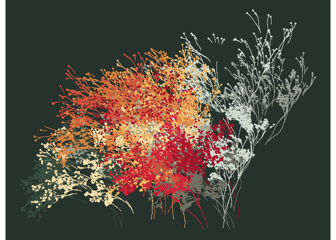
The following three images were created using the {aRtsy} package.
Functions:
my_formula <- list(
  x = quote(runif(1, -1, 1) * x_i^2 - sin(y_i^2)),
  y = quote(runif(1, -1, 1) * y_i^3 - cos(x_i^2))
)

canvas_function(colors = mex.brewer("Atentado"),
                polar = FALSE,
                by = 0.005,
                formula = my_formula)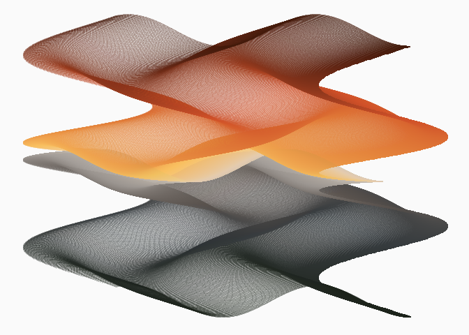
Mosaic:
canvas_squares(colors = mex.brewer("Alacena"),
               cuts = 20,
               ratio = 1.5,
               resolution = 200,
               noise = TRUE)
Mandelbrot’s set:
canvas_mandelbrot(colors = mex.brewer("Naturaleza"),
                  zoom = 8,
                  iterations = 200,
                  resolution = 500)
These plots are adaptations of Meghan Harris’s artsy waves. Create data frames with wave functions:
##Set up the "range" on the x axis for horizontal waves=====
wave_theta <- seq(from = -pi,
                  to = -0,
                  by = 0.01)

# Create waves using functions
wave_1 <- data.frame(x = wave_theta) |>
  mutate(y = (sin(x) * cos(2 * wave_theta) + exp(x * 2)))

wave_2 <- data.frame(x = wave_theta) |>
  mutate(y = (0.5 * sin(x) * cos(2.0 * wave_theta) + exp(x)) - 0.5)
Define a function to convert a single wave into a set of
n waves. The function takes a data frame with a wave
function and returns a data frame with n waves:
# Creating a function for iterations====

wave_maker <- function(wave_df, n, shift){

  #Create an empty list to store our multiple dataframes(waves)#
  wave_list<- list()

  #Create a for loop to iteratively make "n" waves shifted a distance `shift` from each other #
  for(i in seq_along(1:n)){

    wave_list[[i]] <- wave_df |>
      mutate(y = y - (shift * i),
             group = i)
  }

  #return the completed data frame to the environment#
  return(bind_rows(wave_list))
}
Create layered waves using the data frames with the wave functions above:
wave_layers <- rbind(wave_1 |>
                       wave_maker(n = 5,
                                  shift = 0.075),
                     wave_2 |>
                       wave_maker(n = 5,
                                  shift = 0.075) |>
                       mutate(group = group + 5)) # adjust the group counter to identify waves uniquely
Plot layered waves using cartesian coordinates and palette
Ofrenda:
ggplot(wave_layers) +
  geom_rect(aes(xmin = -pi,
                xmax = -0.0,
                ymin = min(y) - 0.50,
                ymax = max(y) + 0.30 ),
            size = 2.5,
            color = mex.brewer("Ofrenda")[6],
            fill = mex.brewer("Ofrenda")[4]) +
  geom_rect(aes(xmin = -pi,
                xmax = -0.0,
                ymin = min(y) - 0.50,
                ymax = max(y) + 0.30 ),
            size = 1,
            color = "black",
            fill = NA) +
  geom_ribbon(aes(x,
                  ymin = y - 0.025 * 4 * x,
                  ymax = y + 0.015 * 10 * x,
                  group = group,
                  fill = group),
              color = "black",
              size = 0.5) +
  scale_fill_gradientn(colors = mex.brewer("Ofrenda"))+
  theme_void() +
  theme(legend.position = "none")
Plot layered waves using polar coordinates and palette
Atentado:
ggplot(wave_layers) +
  geom_rect(aes(xmin = -pi,
                xmax = -0.0,
                ymin = min(y) - 0.45,
                ymax = max(y) + 0.30 ),
            size = 2.5,
            color = mex.brewer("Atentado")[6],
            fill = mex.brewer("Atentado")[3]) +
  geom_rect(aes(xmin = -pi,
                xmax = -0.0,
                ymin = min(y) - 0.45,
                ymax = max(y) + 0.30 ),
            size = 1,
            color = "black",
            fill = NA) +
  geom_ribbon(aes(x,
                  ymin = y - 0.025 * 4 * x,
                  ymax = y + 0.015 * 10 * x,
                  group = group,
                  fill = group),
              color = "black",
              size = 0.5) +
  scale_fill_gradientn(colors = mex.brewer("Atentado")) +
  coord_polar(theta = "x",
              start = 0,
              direction = 1,
              clip = "on") +
  theme_void() +
  theme(legend.position = "none")


